Onze Security Boot Camp nu onderdeel van OutSystems aanbod
Arranging Oracle APEX items & buttons
Utilizing the power of universal theme classes
Responsive classes
In the example below I’ve given the page items a column span of 4 and the button the column position 12. Now, the button isn’t fully in the right corner.

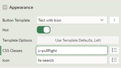
One of the solutions is to give the button the u-pullRight class. The u-pull{Direction} class lets an item float in the specified direction.

In the following example, the button is now fully in the right corner.

You can find more responsive classes on apex.oracle.com/ut. A set of classes that I often use are the width classes. The table below shows the classes you can use. For example: you want to responsive size your region to be 67% wide with a max width of 800px. You only have to add two classes to your region: w67p and mxw800.
| Classes | Values | Description |
| wamount | 10-800 px | Sets the element’s width to specified value. Sizes in 10px increments. |
| wpercentagep | 5-100 % | Sets the element’s width to specified percentage. Percentages in 5% increments |
| mnwamount | 10-800 px | Sets the element’s min-width to specified value. Sizes in 10px increments |
| mxwamount | 10-800 px | Sets the element’s max-width to specified value. Sizes in 10px increments |
Flex
To provide even greater flexibility, you can leverage the power of Flexbox, a layout model in CSS designed for building flexible and efficient user interfaces. Add the u-flex class to the region; this makes the region a flex container, and the items become flex children. Flexbox allows you to create complex layouts with ease, providing a more dynamic and responsive design.
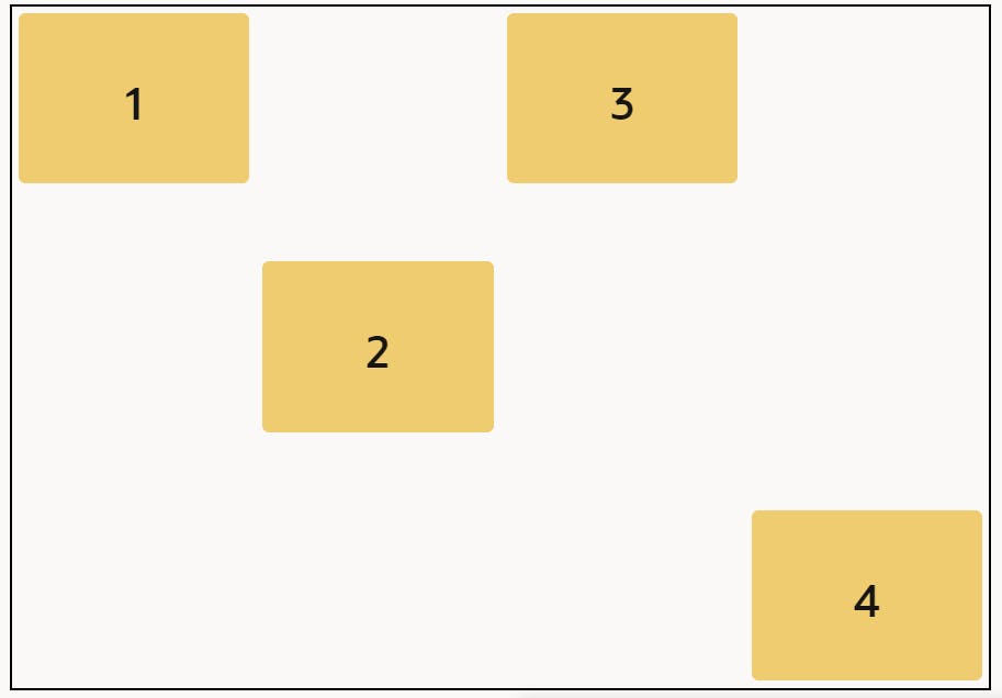
Aligning multiple items on multiple rows can be a bit more tricky. If you want to arrange your components like the items below, you can also use the responsive classes. First, you’ve to set your region template to ‘Blank with attributes (No Grid)’ in the appearance attributes. This removes the 12 grid layout from your region and gives you more freedom to move your items around. Add the u-flex class to the region, this makes the region a flex container and the items flex children.
Lastly, you can add the class u-align-items-{position} to the components. In the example below, I’ve added the following classes:
- u-align-self-flex-start
- u-align-self-center
- u-align-self-baseline
- u-align-self-flex-end

This example is still quite simple but illustrates well what you can achieve with these classes.
To learn more about Flexbox properties, I recommend checking here. The CSS-tricks website provides multiple guides on CSS and how to use it. Understanding Flexbox will empower you to create sophisticated and responsive layouts for your APEX applications.
Conclusion
By considering responsive design principles and utilizing the classes provided by the Universal Theme, you not only enhance the visual appeal of your APEX applications but also ensure a consistent and user-friendly experience across a diverse range of devices. Embracing responsive design is a strategic choice that can positively impact user satisfaction, accessibility, and the overall success of your applications.

